Yet with any changes to a field come challenges. Since several types of linguistic data violate the assumptions of ANOVA, what method should you use instead? With several newer methods (multi-level modeling, generalized additive models, growth curve analysis, spine ANOVA, functional data analysis, Bayesian methods, etc), it is often also unclear what statistic to report. If we are concerned about replicability in our field, how do we ensure that our methods are clear enough to be replicated? And, importantly, how do we communicate these concerns to both novice and experienced researchers that might not be familiar with them? Since so many methods are new (or new to some of us), we are often tempted to include a fancier model without understanding it fully. How do we ensure we understand it enough to use it?
These issues are all very important, but we must also not lose sight of our duty as scientists to properly communicate our research. It would be great if our research could "speak for itself." It would be great if we could rely on our readers being so engaged in our results that they never got bored or frustrated reading pages and pages of statistical modeling and tests. It would great if we could assume that all readers understood the mechanics of each model too. Yet, our research seldom speaks for itself and readers can be both bored and uninformed. Unless your research findings are truly groundbreaking, you probably have to pay attention to your writing style.
I'm not an expert in writing or an expert in statistical methods. I teach a somewhat intense graduate course in quantitative methods in linguistics and have been a phonetician for about 15 years (if I include some time in grad school). My graduate education is in linguistics, not mathematical psychology or statistics. But as a researcher/phonetician I am a practitioner of statistical tests, as a reviewer I read many submitted manuscripts in phonetics, and as a professor I frequently evaluate how students talk about statistics in writing. I think that the best way to open up a discourse about how we report statistics in linguistics and whether it is readable or not is to present various strategies and to discuss their pros/cons.
I should mention that I'll be pulling examples from my own research in phonetics here as well as a few that I've seen in the literature. I am not intending to offend any particular researcher's practice. On the contrary, I feel that it's necessary to bring up some real examples in this discussion (and I've picked some good ones).
I. The laundry list
One practice in reporting statistics is to essentially report all the effects as a list in the text itself. We've all seen this practice, but after digging for an example of it, I was happy to discover that it is not nearly as frequent as I had assumed (or perhaps we've become better writers). So, here's a made-up example:
There were significant main effects of vowel quality (F[3, 38] = 6.3, p < .001), age (F[6, 12] = 2.9, p < .01), speech style (F[2, 9] = 5.7, p < .001), and gender (F[3, 8] = 3.2, p < .01) and significant interactions of vowel quality x age (F[18, 40] = 2.7, p < .01], vowel quality x gender (F[12, 20] = 2.4, p < .05), but no significant interaction between vowel quality and gender nor between vowel quality and speech style. There were significant three-way interactions between vowel quality x gender x speech style (F[12, 120] = 2.4, p < .05) but no three-way interaction between either... These effects are seen in the plot of the data shown in Figure 3.
Effect, stat, effect, stat, effect, stat, repeat. It almost sounds like an exercise routine. On the one hand, this method of reporting statistics is comprehensive - all our effects are reported to the reader. We also avoid the issue of tabling your statistics (more on this below). Yet, it reads like a laundry list and a reader can quickly forget (a) which effect to pay attention to and (b) what each effect means in the context of the hypothesis being explored.
If the research involves just one or two multivariate models for an entire experiment, the researcher might be forgiven for writing this way, but now let's pretend that there are eight models and you are reading the sample paragraph above eight times within the results section of a paper. Then you go on to experiments 2 and 3 and read the same type of results section two more times. By the end of reading the paper, you may have seen results indicating an effect or non-effect of gender x vowel quality twenty-four times. It truly becomes a slog to recall which effects are important in the complexity of the model and you might be forgiven for losing interest in the process.
There is an additional problem with the laundry list method - our effects have been comprehensively listed but the linkage between individual effects and an illustrative figure has not been established. It might be clear to the researcher, but it's the reader who needs to interpret just what a gender x vowel quality interaction looks like from the researcher's figure. Without connecting the specific statistic and the specific result, we both risk over-estimating the relevance of our particular effect in relation to our hypothesis (risking a Type I error) and we fail to guide our readers in interpreting our statistic the right way (producing either Type S or Type M errors). Our practice of reporting statistics can influence our statistical practice.
Tip #1: Connect the model's results to concrete distinctions in the data in the prose itself.
Now, just what does it look like to connect statistics to the data? and how might we easily accomplish this? To learn this, we need to examine additional methods.
II. The interspersed method with summary statistics
If it's not already clear, I'm averse to the laundry list method. It's clear that we need to provide many statistical results to the reader, but how do we do this in a way that will engage them with the data/results? I think that one approach is to include summary statistics in the text of the results section immediately after or before the reported statistic. This has three advantages, in fact. First, the reader is immediately oriented to the effect to look for in a figure. Second, we avoid both type S and type M errors simultaneously. The sign and the magnitude of the effect are clear if we provide sample means alongside our statistic. Third, it breaks up the monotony found in a laundry list of statistical effects. Readers are less likely to forget about what the statistic means when it's tied to differences in the data.
I have been trying to practice this approach when I write. I include an excerpt from a co-authored paper here below (DiCanio et al. 2018). As a bit of background, we were investigating the effect of focus type on the production of words in Yoloxóchitl Mixtec, a Mixtec language spoken in Guerrero, Mexico. Here, we were discussing the combined effect of focus and stress on consonant duration.
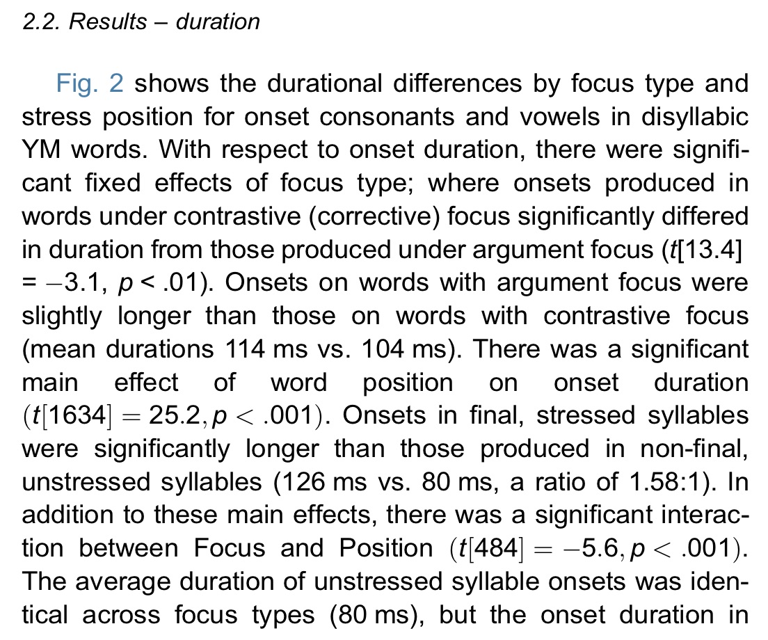
The statistics reported here are t values from a linear mixed effects model using lmertest (Kuznetsova et al. 2017). The first statistic mentioned is the effect of focus type on onset duration. This effect is then immediately grounded in the quantitative differences in the data - a difference between 114 ms and 104 ms. Then, additional statistics are reported. This approach is avoiding Type S and Type M errors and it makes referring to Figure 2 rather easy. The reader knows that this is a small difference and they might not make much of it even though it is statistically significant. The second statistical effect is related to stress. Here, we see that the differences are more robust - 126 vs. 80 ms. Figure 2, which we referred the reader to above, is shown below.

While it is rather easy to get some summary statistics for one's data, what do you do when you need more complex tables of summary statistics? I generally use the ddply() function in the plyr package for R. This function allows one to quickly summarize one's data alongside the fixed effects that you are reporting in your research. Here's an example:
ddply(data.sample, .(Focus, Stress), summarize, Duration = mean(Duration, na.rm=TRUE))
For a given data sample, this will provide mean duration values for the fixed effects of focus and stress. One can specify different summary statistics (mean, sd, median, etc) and include additional fixed effects. While this may seem rather trivial here (it's just a 2x2 design after all), it ends up being crucially useful for larger multivariate models where there are 2-way and 3-way interactions. If each factor includes more than four levels, a two-way or three-way interaction can become harder to interpret. Leaving this interpretation open to the reader is problematic.
Now, for the person in the room saying "don't post-hoc tests address this?" I would point out that many of the statistical tests that linguists have been using more recently are less amenable to traditional post-hoc tests. (Is there an equivalent to Tukey's HSD for different multi-level models?) Also, if there are a number of multivariate models that one needs to report, the inclusion of post-hoc tests within a manuscript will weigh it down. So, even if certain types of post-hoc tests were to address this concern, they still would end up in an appendix or as article errata and essentially hide a potential Type M or Type S error.
We've now connected our statistics with our data in a clearer way to the reader and resolved the potential for Type S and M errors in the process. I think this is a pretty good approach. It also manages to treat the audience as if they need help reading the figure because the text reiterates what the figure shows. Is this "holding the reader's hand" too much? Keep in mind that you are intimately familiar with your results in a way that the reader is not and the reader has many other things on their mind, so it is always better to hold the their attention by guiding them. Also, the point is to communicate your research findings, not to engage in a competition of "whose model is more opaque?". Such one-upmanship is not an indicator of intelligence, but of insecurity.
What are the downsides though? One potential issue is that the prose can become much longer. You are writing more, so in a context where more words cost more to publish or where there is a strict word limit, this method is less good. This issue can be ameliorated by reporting summary statistics just for those effects which are relevant to the hypothesis under investigation. There is another approach here as well - why not just eliminate statistics from the results section prose altogether. If it is the statistics that get in the way of interpreting the relationship between the hypothesis and results, we could just put the statistics elsewhere.
III. Tabling your stats
Another approach to enhancing the readability of your research is to place the results from statistical tests and models in a table. I'll admit - when I first studied statistics I was told to avoid this. Yet, I can also see the appeal of this approach. Consider that as models have gotten more complex, there are more things to report. If one is avoiding null hypothesis significance testing or if one is avoiding p values, a set of different values might need to be reported which would otherwise be clunky within the text itself. At the same time, reviewers have been demanding more replicability and transparency within statistical models themselves. This means that they may wish to see more details - many of which need to be included in a table.
A very good recent example of this is found in an interesting recent paper by Schwarz et al. (2019) where the authors investigated the phonetics of the laryngeal properties of Nepali stops. I have included a snippet of this practice from this paper below (reprinted with authors' permission).
 |
| Snippet from p,123 of Schwarz, Sonderegger, and Goad (2019), reprinted with permission of the authors. |
One general advantage of tabling statistics is that reading one's results becomes more insightful. When done in a manner similar to what Schwarz et al. do above, readers also do not forget about the statistics completely. This is accomplished by commenting on specific effects in the model even though all the statistics are in the table.
If this is not done, however, the potential problem is that the reader might forget about the statistics completely. In such a case, the risk for a Type M or Type S error is inflated. Moreover, sometimes the effect you find theoretically interesting is not what is driving improvement to statistical model fit. This is obscured if individual results are not examined in the text at all.
Tip #2: Whether tabling your stats or not, always include prose discussing individual statistical effects. Include magnitude and sign (positive or negative effect) in some way in the prose.
There is, of course, another alternative here - you can always combine an interspersed method with the tabling of statistical results. This would seem to address both a frequent concern among reviewers that they be able to see specific aspects of the statistical model while also not relegating the model to an afterthought while reading. I could talk about this method in more detail, but it seems as if most of the main points have been covered.
IV. Final points
There are probably other choices that one could make in writing up statistical results and I welcome suggestions and ideas here. As phonetics (and linguistics) have grown as fields, there has been a strong focus on statistical methods but perhaps less of an overt conversation about how to discuss such methods in research effectively. One of the motivations to writing about these approaches a bit is that, when I started studying phonetics in graduate school, much of what I saw in the speech production literature seemed to follow the laundry list approach. Yet, if you have other comments, please let me know.
References:
DiCanio, C., Benn, J., and Castillo García, R. (2018). The phonetics of information structure in Yoloxóchitl Mixtec. Journal of Phonetics, 68:50–68.
Schwarz, M., Sonderegger, M., and Goad, H. (2019). Realization and representation of Nepali laryngeal contrasts: Voiced aspirates and laryngeal realism. Journal of Phonetics, 73:113–127.
Kuznetsova, A., Brockhoff, P. B., and Christensen, R. H. B. (2017). lmerTest Package: Tests in Linear Mixed Effects Models. Journal of Statistical Software, 82(13):1–26.
This comment has been removed by a blog administrator.
ReplyDelete